Showing posts with label photoshop. Show all posts

Monday, March 19, 2007

Adding a stroke, border and logo!


I received an email the other day asking how I created my blog proof action that adds the border, keyline and logo to my images that I post on the blog. So here is a step by step tutorial on how I do it.

I want my blog proof to end up as 600 pixels on the long side. To do this, we will need to set up two actions, one for vertical and one for horizontal. Record this as you do it.

  1. Open a horizontal image
  2. Create a new Action called "Horizontal Blog Proof"
  3. Resize the image to 500 pixels wide
  4. Duplicate the layer - you can do this in the layers palette by dragging the layer called "background" to the new tab, which looks like a miniature blank piece of paper, at the bottom of the palette
  5. Resize the Canvas to 600 pixels and choose the appropriate color for your background (I chose black, of course). This will create a large, even black border all the way around your image.
  6. Select the top of your two layers and add a stroke of the color you like by clicking on the circled "f" at the bottom of the layers palette and choosing stroke. The image above is a one pixel, white, inner stroke.
  7. Now stop recording and create a snapshot of your file.
  8. It is time to set up your Logo file, so open your source logo.
  9. Resize your logo to slightly larger than you expect to use it on your image.
  10. Drag the logo to your image, this will create a new layer with just your logo on it. There should not be a background on your logo at this point. If there is, you may have to go to a different version of your logo that you received from your designer.
  11. Drag the logo to where you want it on your image.
  12. Resize the logo to the right size by using the Free Transform tool (Cntrl+T). Make sure to hold down the shift key as you drag the corner so the logo does not get warped.
  13. Delete the layers besides the logo (to delete the layer titled "background" you will have to rename it first)
  14. Create a blank layer and drag it to underneath the logo. You should now have two layers, one with your logo on it, and one blank below it.
  15. Save this in a location that you can find it again as a photoshop (.psd) file with the name something like "horizontal logo file for blog"
  16. Now look at your history palette and choose the snapshot of your file that you created before you started working on your logo.
  17. Go to your action and start recording again
  18. Choose the Place command (File-->Place) and choose the Horizontal logo file for blog.
  19. If it does not automatically put the logo in the right place, you may have to make sure all the corners line up.
  20. Flatten the image (Layer-->Flatten) and stop recording, you are done.
You will have to repeat this for the vertical action. It is also then possible to create a script that tells whether the image is horizontal or vertical and run the appropriate action on it. Once it is set up, you can always modify the action as your tastes change. Also, once it is set up, all you have to do is run the action and it does all this work for you automatically, every time!

Tuesday, February 20, 2007

Interesting B&W Conversion


Sean Flanigan has a fun b&w technique to play with over on his blog. Below is the photograph I took of Leslie recently. I played with the technique Sean talks, modified it a bit and added a slight sepia tone to add to the vintage feel.

Wednesday, February 14, 2007

Happy Valentine's! And a b&w conversion for Photoshop

Hey gang. I hope you have a fantastic holiday with your loved ones!

Today I'm going to show you how to make a really fast, simple, high-contrast black & white conversion.

The first step is to make sure that you have the default black on white color set.

Then go the the layers palette and click on the adjustment layers symbol.

The third and final step is to choose the "Gradient Map" option.

All Done. Here is a before and after.


Monday, February 12, 2007

The Hows and Whys of Color Management!

Color management is the processes that photographers need to use to make sure their images look how they should!

Why would you want to be color managed? Well, if you haven't calibrated it already, your monitor sucks for looking at photographs! Out of the box, monitors are typically far too bright, have too much blue color, and make your photographs look horrible. The good news is that it is easy to fix!

The first step is to get some sort of monitor calibration device. You can find a whole lot of options at b&h, the world's largest photo store in New York. What you need really depends on how serious you are. Any of them are better than nothing and both Colorvision and Pantone have excellent solutions for around $200.

Then you follow the very easy steps that the software included in the bundle will walk you through. This takes about 15 minutes and should be done once every couple of months, unless you just bought a new monitor, in which case you should do it weekly until you see very little in the way of changes between adjustments.

Then you send in a file to your lab. Make sure to request no corrections. When you get the print back, compare it to your photograph on your monitor. You may need to make some minor corrections to your color profile.

One Image from start to finish

featuretteonline.jpg


This is an explanation of how an image was created from start to finish.

This image was taken during the couples first dance. I saw the fantastic hard light coming from the far side of them and positioned myself to point the camera directly at the light so I could work with the flare. I find working with flare to be pretty unpredictable, so I was just playing, trying to get the look that I wanted. Then I saw the brides daughter watching them dance and thought it was perfect.

After I had the shot, I brought the image into Photoshop. First I cropped the image. Then I duplicated the background layer and changed the blending mode (found at the top of the layers palette) to Overlay. I adjusted the opacity to 70 per cent. Next I added a Guassian Blur to the Overlay layer to give it the glowing look.

My next step was I made a black and white conversion layer (my favorite method is via gradient map). I adjusted the layer opacity to about 60 per cent.

My final step was to add curves adjustment layer. I pulled up on the middle of the curve until the daughter was the tone that I wanted her. Then I inverted the layer and painted only the little girl back in using the attached layer mask to the adjustment layer.

Flatten, save and done!

Cory Parris is wedding photographer in Seattle, Washington. He loves his wife, his kids, owning his own business, and photography. He is constantly mixing them together to see what he comes up with!

You can find Cory on the web at www.coryparris.com and here!

Speeding Up the Workflow

Improving Your CS2 RAW Workflow With Pre-sets

How is it that some photographers claim that they get done with their post-processing so fast? How do I do all my post-processing for 600 photographs in three hours?

Hey, I thought you’d never ask. The answer really is quite simple. Pre-sets in Bridge. This is also the same concept Adobe is using with their new Lightroom project. By using pre-sets, you can bypass the slow and tiresome Adobe Camera Raw (ACR) window.

The first step to working with Bridge is to set up your processing defaults. You can see that I have mine set up to do a lot of the work for me. I find that it is faster to let Bridge adjust the Exposure, Shadows, and Brightness automatically. I have White Balance, Hue, Contrast, and Saturation set to a specific value.

canon-eos-30d-020cr2-iso-400-1-200-f-28-17-5555-mm-11-30-2006-7-26-54-pm.jpg

You will have to play with your setting until you get them perfected how you like them. A couple of tricks that I use is the lens correction tab to add a soft vignette to each images and I bump up the contrast and saturation to give it the pop that I love. Once you have it the way you like it, save the default setting by clicking the triangle just to the right of where it says Camera Raw Defaults and clicking "Save New Camera Raw Defaults". You will have to do this for each different camera model (5D, 30D, etc.) that you use.

Now, let's make sure the pre-sets we are about to use will show up when we want them to in Bridge. You will need to go to the Edit menu in Bridge and choose Preferences. Then click on the Advanced option in the list on the left. The screen below will show up (you may need to click on it to make it big enough to see). Make sure that you have the "Double click edits Camera Raw settings in Bridge" and "Use Distributed Cache When Possible" options are checked. This will make things work correctly.

preferences-12-1-2006-8-42-16-am.jpg

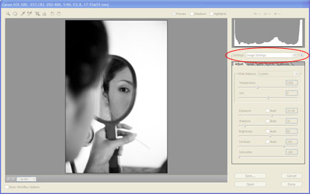
Now that you have that done, you need to save some presets. Probably one of the first that you will want to set up is a b&w preset. It is possible to create some great b&w settings in bridge by desaturating and adjusting contrast. You can also use the calibrate tab to adjust the tones in the image in a way similar to using filters with black and white film. Once you have your recipe created, you need to save it by clicking the arrow just to the right of where it says Image Settings in the drop-down menu.

canon-eos-30d-037cr2-iso-400-1-40-f-28-17-5555-mm-11-30-2006-8-01-40-pm.jpg

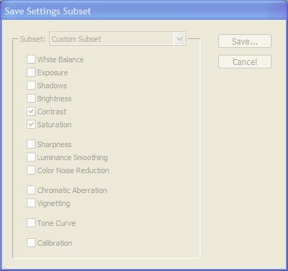
Choose the option Save Image Subset. When the next window pops up, choose only the check boxes that apply to the recipe that you want to save. In this case, it is saturation and contrast. save-settings-subset-12-1-2006-9-02-29-am.jpg

Click Save and give it a name that you will easily be able to recognize when you see it. For this one, you might try "B&W - Basic". That way you can keep all of your B&W actions together.

Now when you are in Bridge, you should be able to right click on any image thumbnail and see "B&W - Basic" as one of your options! Cool. Now repeat this process of saving presets for anything you normally do. I have them for exposure (-2.0, -1.5, -1.0, -0.5, -0.0, +0.5, etc.), brightness, contrast, curves, white balance, multiple b&w, a kind of cool sepia-ish muted color (true sepia is impossible to create in Bridge as far as I can tell), color pops, high contrast, and cross-process effects. And they are all point and click.

Another cool thing about this sort of processing is that the concepts and even some of the settings will be useable in Lightroom though you will have to go through the process of creating the presets again.

If you don't want to create your own presets, you can purchase them from Kevin Kubota and David Jay. Good luck and let me know how it goes!

Cory Parris is wedding photographer in Seattle, Washington. He loves his wife, his kids, owning his own business, and photography. He is constantly mixing them together to see what he comes up with!

You can find Cory on the web at www.coryparris.com and here!